Motion
Modelling
Texturing
Product
Environment
Typography
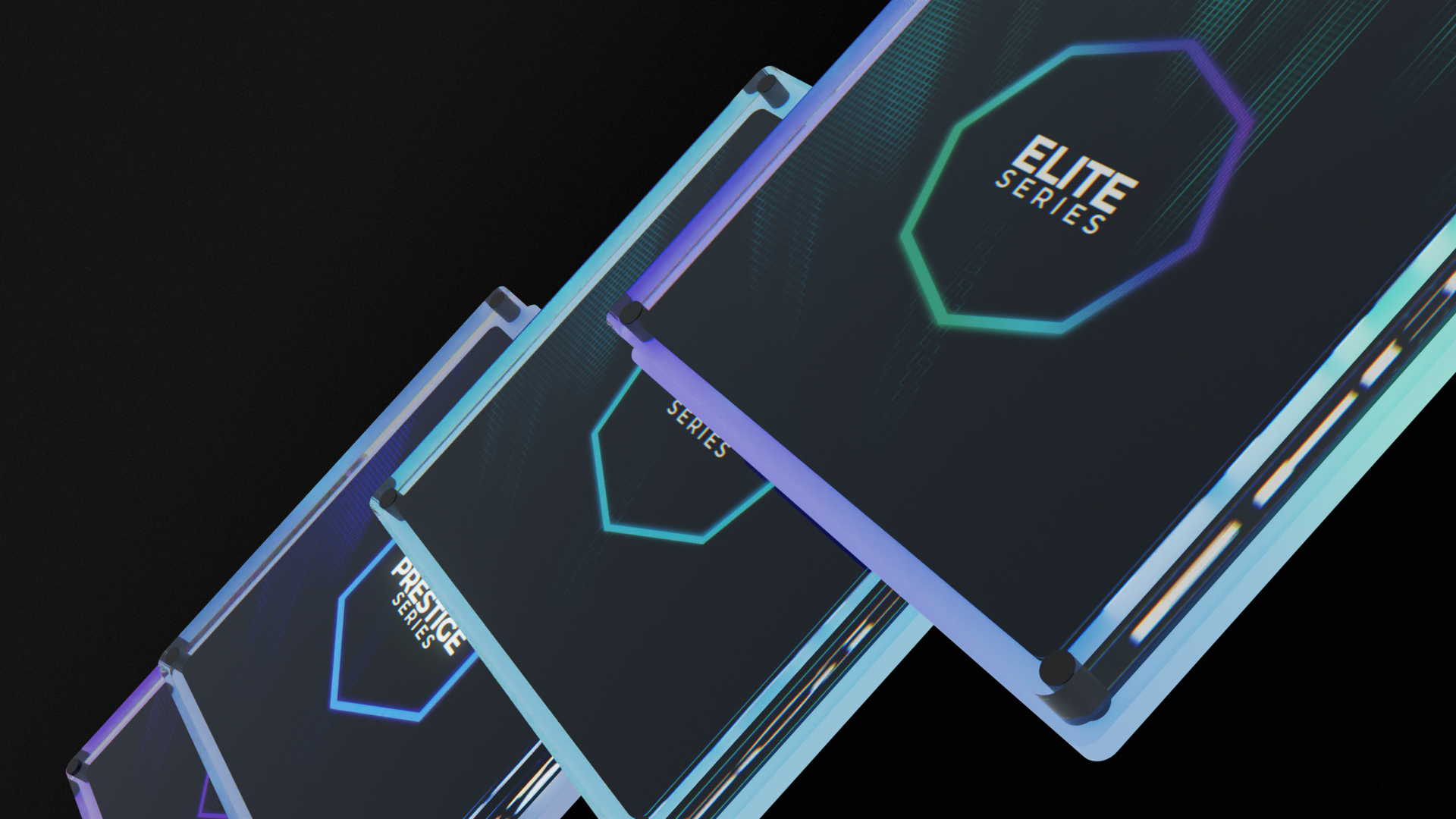
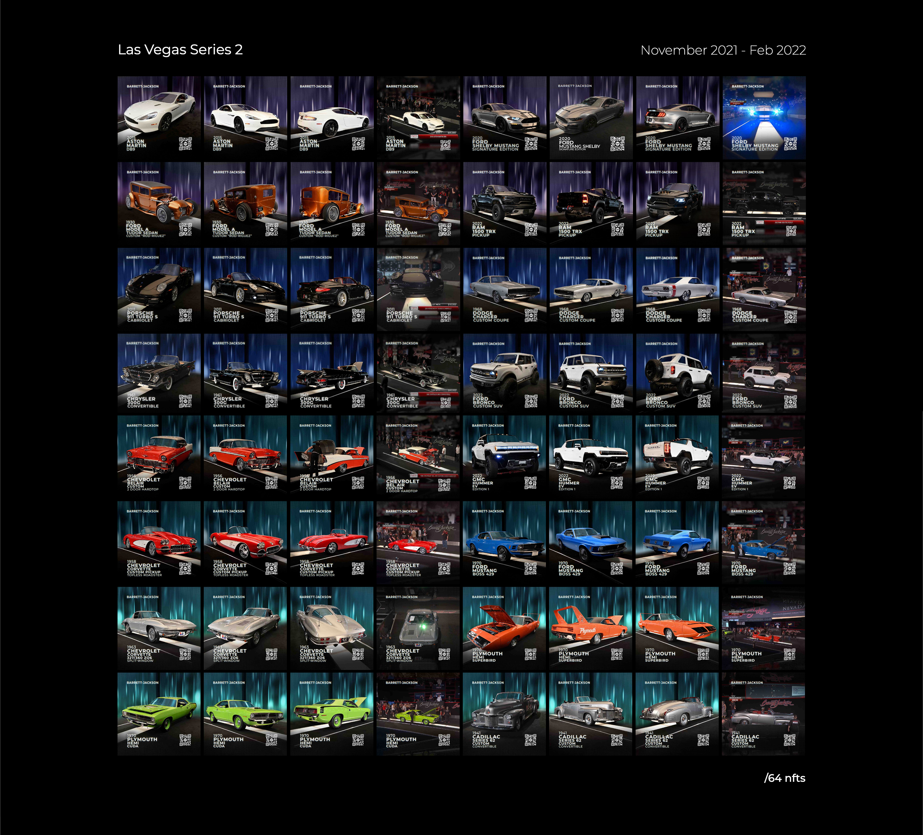
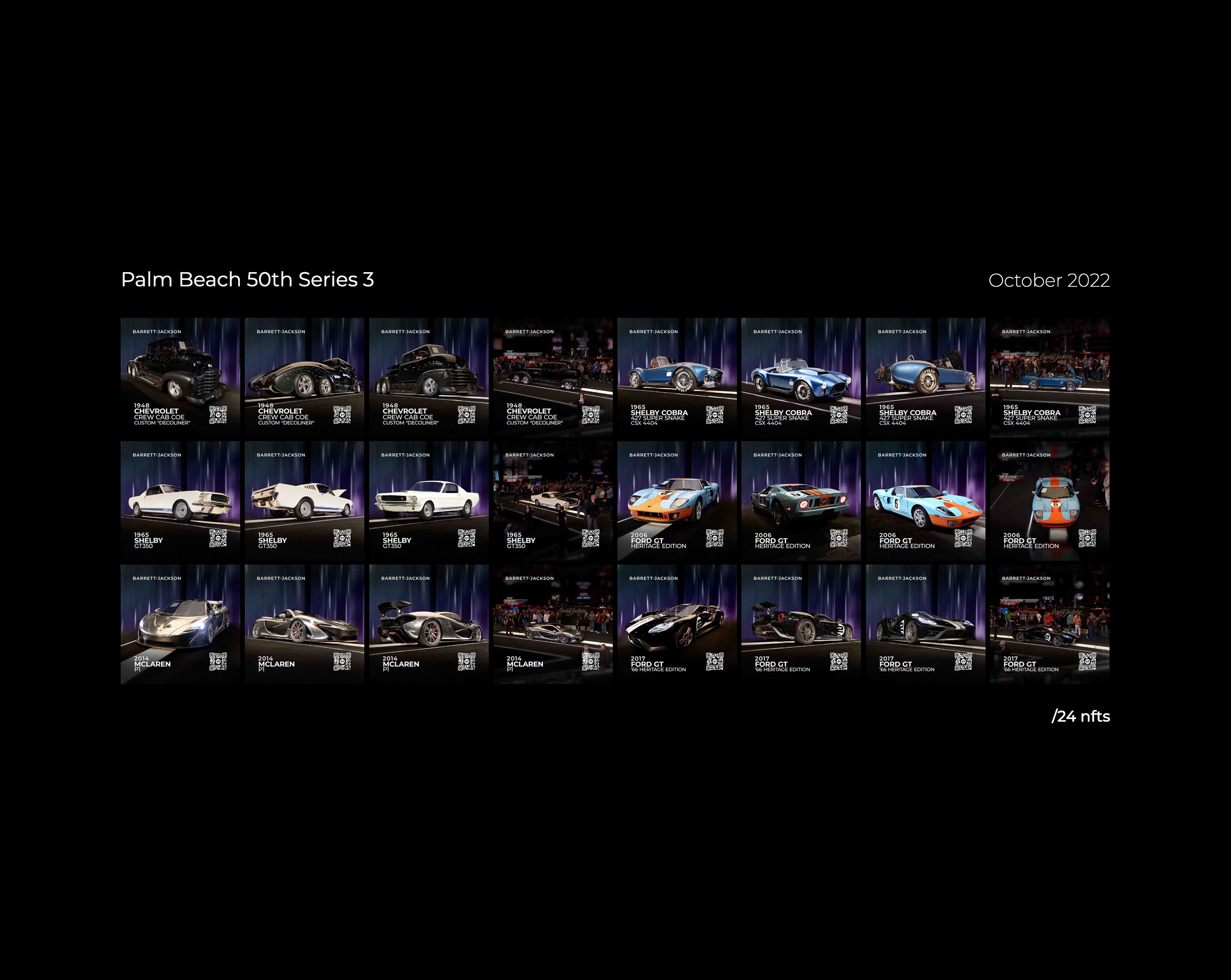
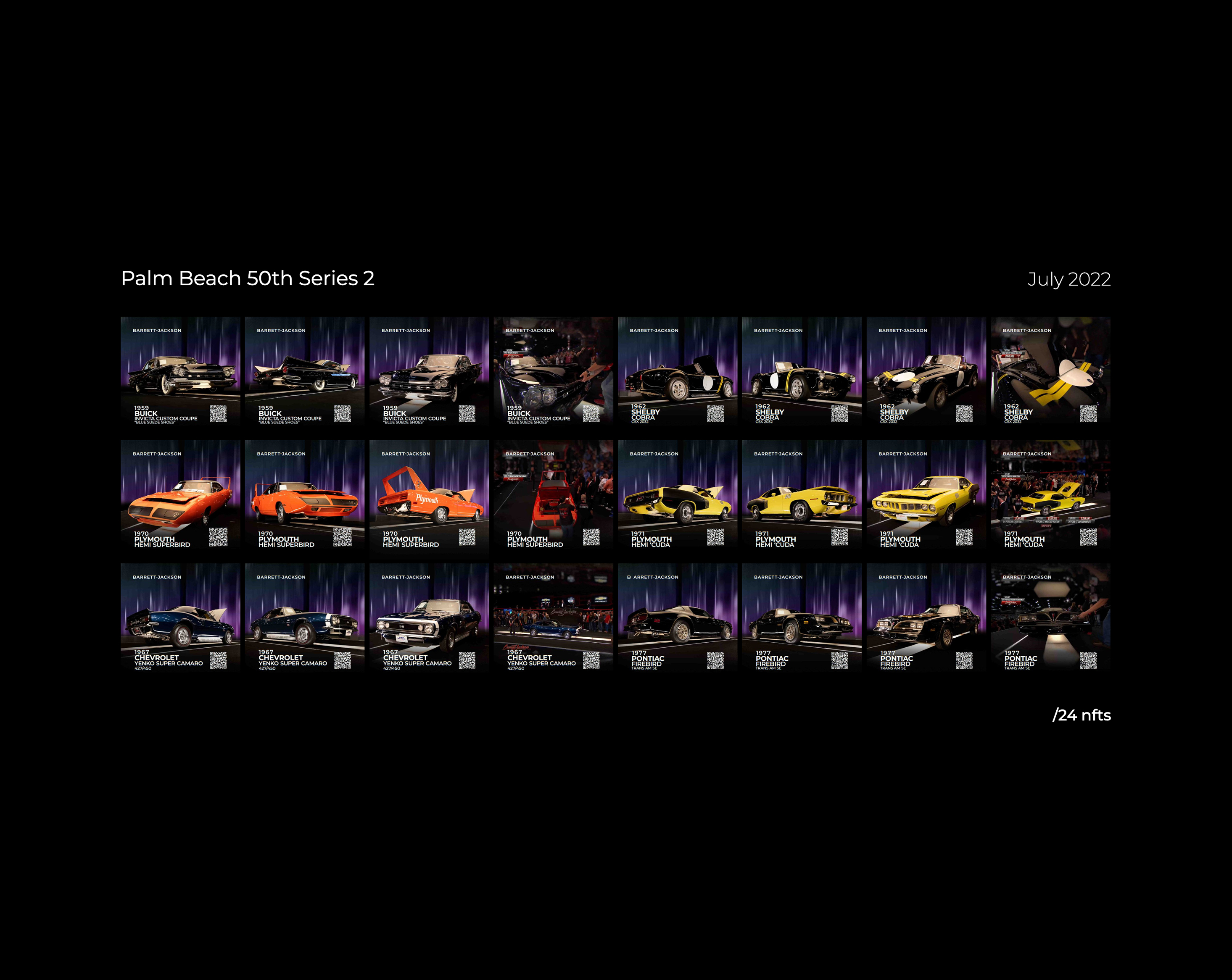
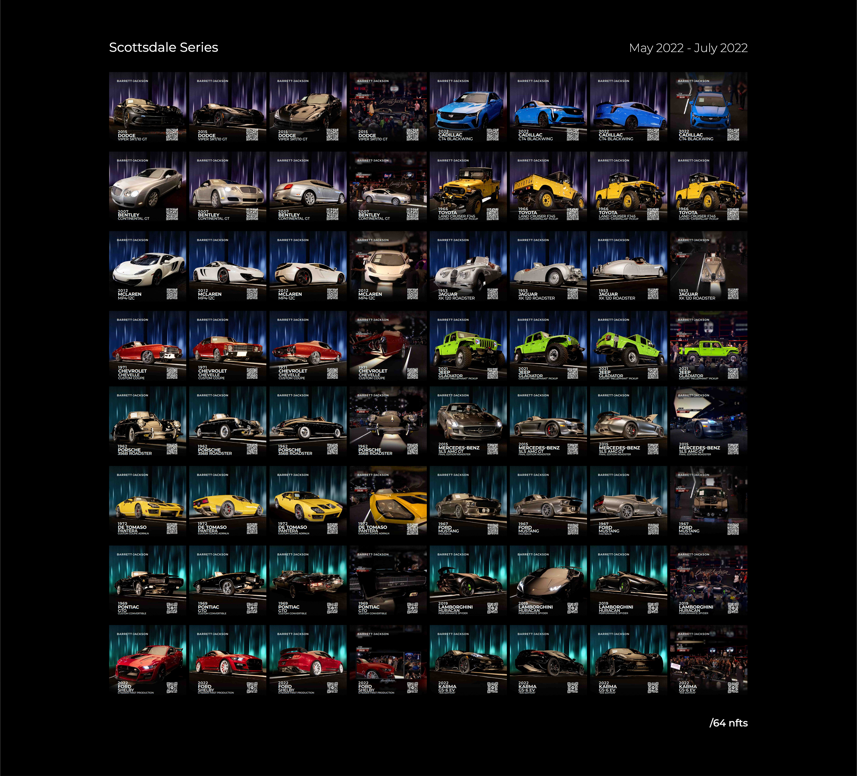
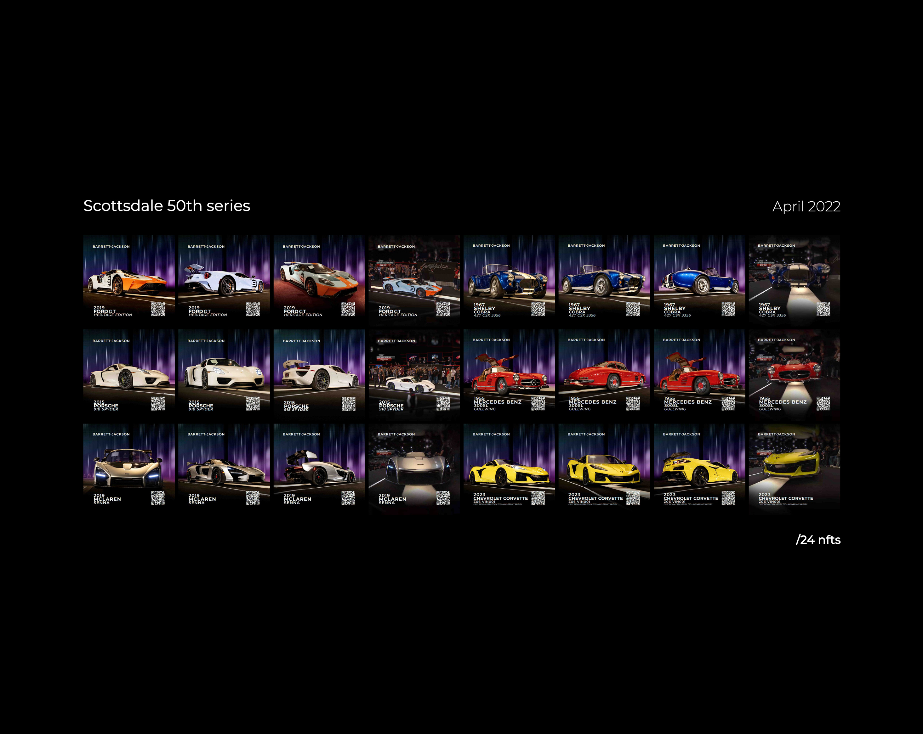
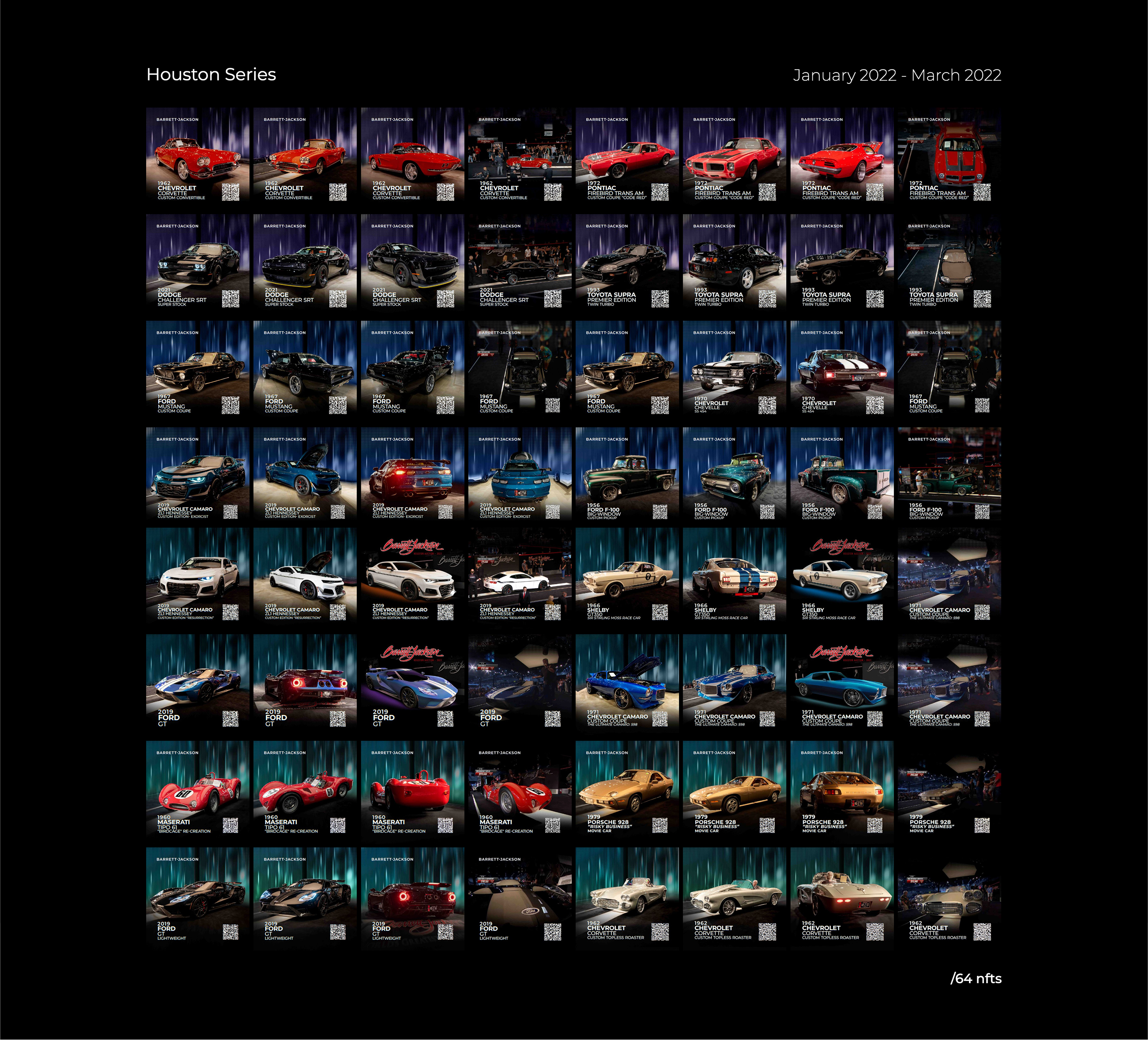
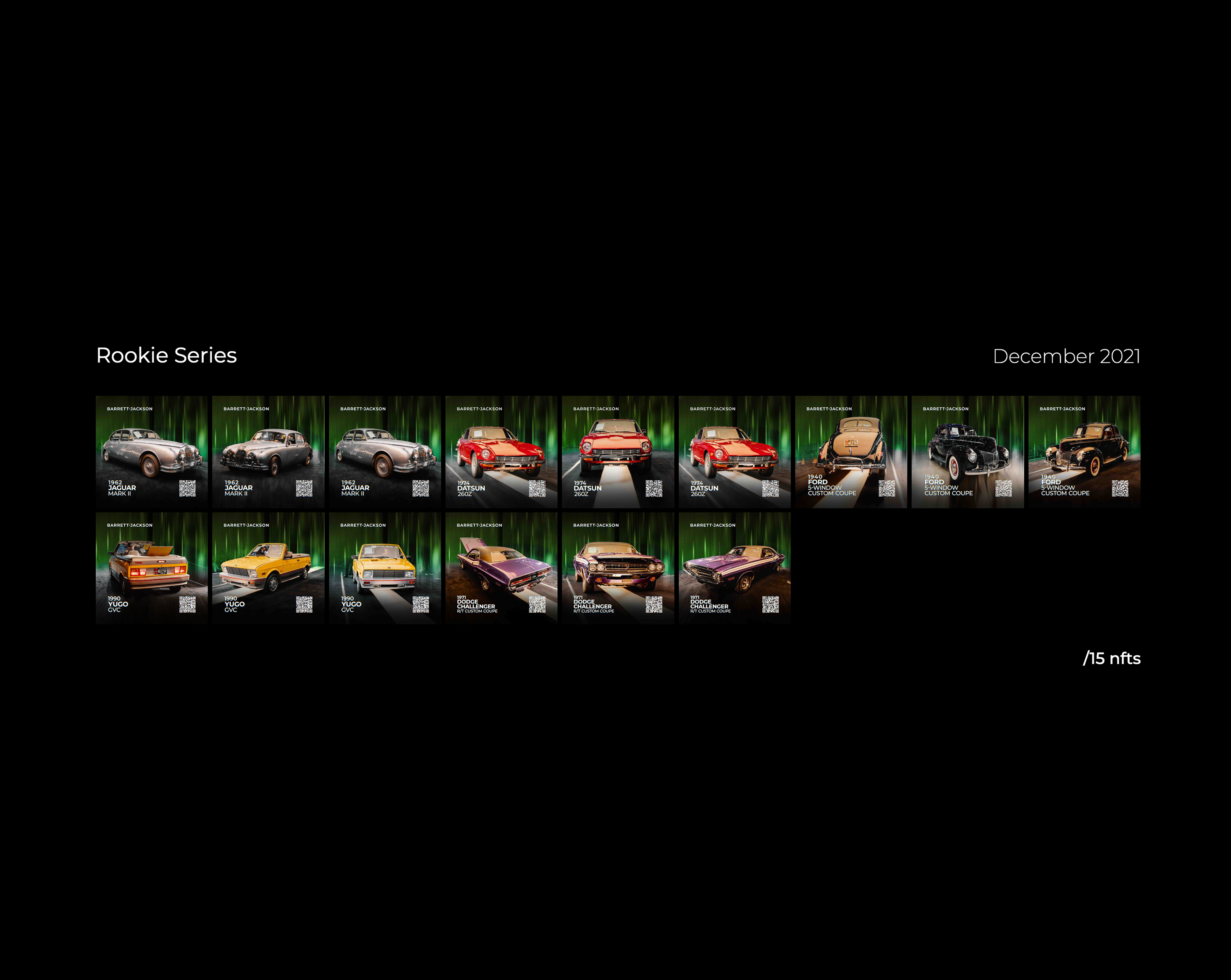
Upon joining Business Instincts Group in 2021, I was tasked with the design of Non-Fungible Tokens (NFTs) for the newly established MotoClub project. As a motion graphics designer, I was responsible for creating visually compelling NFTs that reflected the essence of the brand. Our team partnered with Barrett-Jackson to obtain the necessary materials, including photos and videos of the collectible vehicles auctioned off at their events. The project scope entailed the creation of three minted photo NFTs and one minted video NFT.Over the past two years, while consistently releasing new content, I maintained a focus on enhancing the quality of our output. This involved continual improvement across several dimensions, including the overall style, typography, colour theory, application of textures, and symbolism. Through four major revisions and numerous smaller adjustments, I strived to deliver the highest possible value to our audience through the NFT production process.
Digital Design
Motion Graphics
3D Rendering
Conceptualization Production
4 Design Iterations/
9 drops/
367 digital assets/
Upon joining Business Instincts Group in 2021, I was tasked with the design of Non-Fungible Tokens (NFTs) for the newly established MotoClub project. As a motion graphics designer, I was responsible for creating visually compelling NFTs that reflected the essence of the brand. Our team partnered with Barrett-Jackson to obtain the necessary materials, including photos and videos of the collectible vehicles auctioned off at their events. The project scope entailed the creation of three minted photo NFTs and one minted video NFT.Over the past two years, while consistently releasing new content, I maintained a focus on enhancing the quality of our output. This involved continual improvement across several dimensions, including the overall style, typography, colour theory, application of textures, and symbolism. Through four major revisions and numerous smaller adjustments, I strived to deliver the highest possible value to our audience through the NFT production process.
Each NFT was sub categorized into tiers according to the vehicle, it’s history, and it’s selling price in the order of; Premier, Prestige, Platinum, and Elite. Each tier was represented by a signified colour and a shape. Following the order of the tiers we have a cool gradient starting with purple and moving our way up to an indigo and for the Elite tier signifying the highest status, represented with a gradient encompassing every colour in the series. Each tier shape’s # of vertices represents the level of tier. Each Pack tier would be represented at the beginning of each NFT to allow users to signify its value. The tier’s colour is followed in the featured vehicle

Graphic Design
Motion Graphics
Upon joining Business Instincts Group in 2021, I was tasked with the design of Non-Fungible Tokens (NFTs) for the newly established MotoClub project. As a motion graphics designer, I was responsible for creating visually compelling NFTs that reflected the essence of the brand. Our team partnered with Barrett-Jackson to obtain the necessary materials, including photos and videos of the collectible vehicles auctioned off at their events. The project scope entailed the creation of three minted photo NFTs and one minted video NFT.Over the past two years, while consistently releasing new content, I maintained a focus on enhancing the quality of our output. This involved continual improvement across several dimensions, including the overall style, typography, colour theory, application of textures, and symbolism. Through four major revisions and numerous smaller adjustments, I strived to deliver the highest possible value to our audience through the NFT production process.
Navigating The Invisible is a revealing portrait of acclaimed visual artist Tim Whiten, an individual who survived war and overcame poverty and racism to become one of North America’s most prolific creators of cultural objects. This project is supported by the Canada Council for the Arts and the Ontario Arts Council.
Each NFT was sub categorized into tiers according to the vehicle, it’s history, and it’s selling price in the order of; Premier, Prestige, Platinum, and Elite. Each tier was represented by a signified colour and a shape. Following the order of the tiers we have a cool gradient starting with purple and moving our way up to an indigo and for the Elite tier signifying the highest status, represented with a gradient encompassing every colour in the series. Each tier shape’s # of vertices represents the level of tier. Each Pack tier would be represented at the beginning of each NFT to allow users to signify its value. The tier’s colour is followed in the featured vehicle
Branding
UX/UI
motion graphics
logo design
Sprout is an app designed for the modern day gardener to utilize the use of hydroponic systems. Hydroponics have been shown to reduce water used by 80%, yield x2 the crops, and at a much faster rate. With50% of habitable land already being used for agriculture and in northern regions can only be used in warmer months.Through our app users can learn the inner workings of hydroponics and how they can set one up for themselves. Throughout the way they can learn about specific plants and their needs to determine the right crops for them to produce a maximum yield.
Each NFT was sub categorized into tiers according to the vehicle, it’s history, and it’s selling price in the order of; Premier, Prestige, Platinum, and Elite. Each tier was represented by a signified colour and a shape. Following the order of the tiers we have a cool gradient starting with purple and moving our way up to an indigo and for the Elite tier signifying the highest status, represented with a gradient encompassing every colour in the series. Each tier shape’s # of vertices represents the level of tier. Each Pack tier would be represented at the beginning of each NFT to allow users to signify its value. The tier’s colour is followed in the featured vehicle
Branding
Design Principles
Vectors
Animation
Typography
Upon joining Business Instincts Group in 2021, I was tasked with the design of Non-Fungible Tokens (NFTs) for the newly established MotoClub project. As a motion graphics designer, I was responsible for creating visually compelling NFTs that reflected the essence of the brand. Our team partnered with Barrett-Jackson to obtain the necessary materials, including photos and videos of the collectible vehicles auctioned off at their events. The project scope entailed the creation of three minted photo NFTs and one minted video NFT.Over the past two years, while consistently releasing new content, I maintained a focus on enhancing the quality of our output. This involved continual improvement across several dimensions, including the overall style, typography, colour theory, application of textures, and symbolism. Through four major revisions and numerous smaller adjustments, I strived to deliver the highest possible value to our audience through the NFT production process.
Each NFT was sub categorized into tiers according to the vehicle, it’s history, and it’s selling price in the order of; Premier, Prestige, Platinum, and Elite. Each tier was represented by a signified colour and a shape. Following the order of the tiers we have a cool gradient starting with purple and moving our way up to an indigo and for the Elite tier signifying the highest status, represented with a gradient encompassing every colour in the series. Each tier shape’s # of vertices represents the level of tier. Each Pack tier would be represented at the beginning of each NFT to allow users to signify its value. The tier’s colour is followed in the featured vehicle
Branding
logo design
motion graphics
product design
Upon joining Business Instincts Group in 2021, I was tasked with the design of Non-Fungible Tokens (NFTs) for the newly established MotoClub project. As a motion graphics designer, I was responsible for creating visually compelling NFTs that reflected the essence of the brand. Our team partnered with Barrett-Jackson to obtain the necessary materials, including photos and videos of the collectible vehicles auctioned off at their events. The project scope entailed the creation of three minted photo NFTs and one minted video NFT.Over the past two years, while consistently releasing new content, I maintained a focus on enhancing the quality of our output. This involved continual improvement across several dimensions, including the overall style, typography, colour theory, application of textures, and symbolism. Through four major revisions and numerous smaller adjustments, I strived to deliver the highest possible value to our audience through the NFT production process.
Each NFT was sub categorized into tiers according to the vehicle, it’s history, and it’s selling price in the order of; Premier, Prestige, Platinum, and Elite. Each tier was represented by a signified colour and a shape. Following the order of the tiers we have a cool gradient starting with purple and moving our way up to an indigo and for the Elite tier signifying the highest status, represented with a gradient encompassing every colour in the series. Each tier shape’s # of vertices represents the level of tier. Each Pack tier would be represented at the beginning of each NFT to allow users to signify its value. The tier’s colour is followed in the featured vehicle


Lifestyle
Product
Portrait
Film
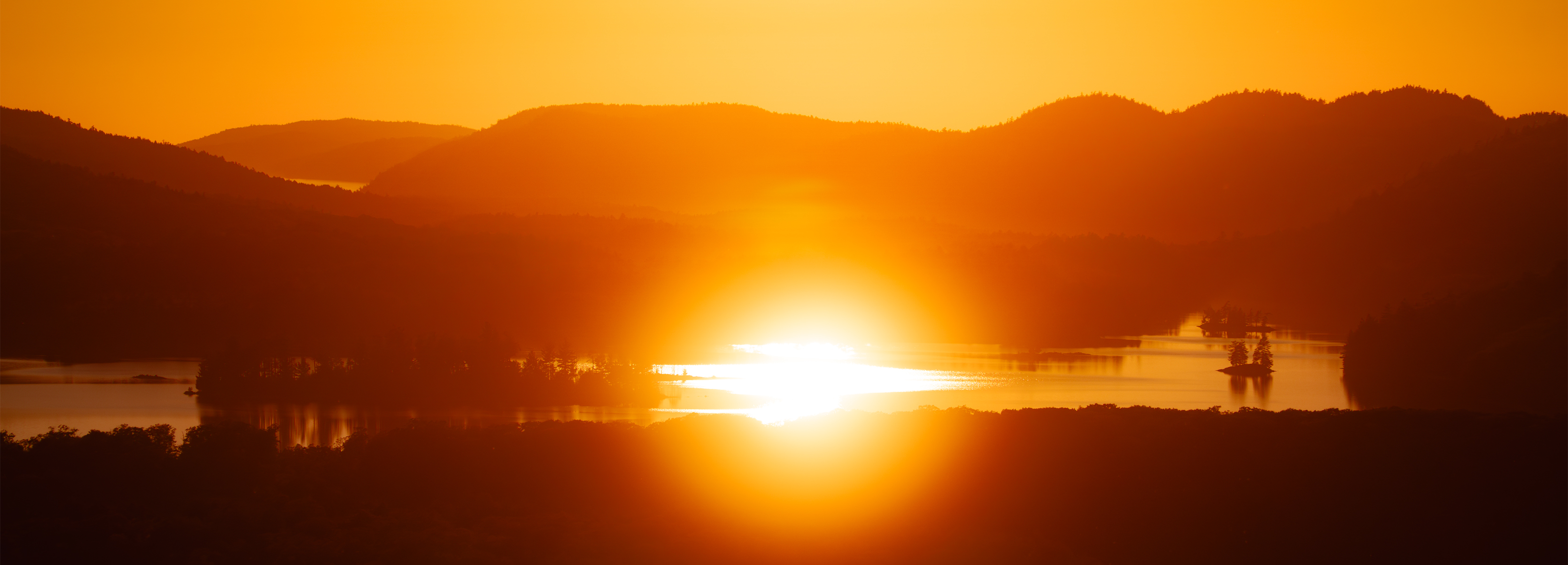
Landscape
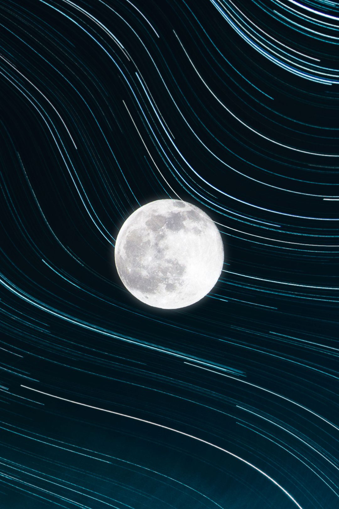
Astro
Time
Wild
Upon joining Business Instincts Group in 2021, I was tasked with the design of Non-Fungible Tokens (NFTs) for the newly established MotoClub project. As a motion graphics designer, I was responsible for creating visually compelling NFTs that reflected the essence of the brand. Our team partnered with Barrett-Jackson to obtain the necessary materials, including photos and videos of the collectible vehicles auctioned off at their events. The project scope entailed the creation of three minted photo NFTs and one minted video NFT.Over the past two years, while consistently releasing new content, I maintained a focus on enhancing the quality of our output. This involved continual improvement across several dimensions, including the overall style, typography, colour theory, application of textures, and symbolism. Through four major revisions and numerous smaller adjustments, I strived to deliver the highest possible value to our audience through the NFT production process.
Each NFT was sub categorized into tiers according to the vehicle, it’s history, and it’s selling price in the order of; Premier, Prestige, Platinum, and Elite. Each tier was represented by a signified colour and a shape. Following the order of the tiers we have a cool gradient starting with purple and moving our way up to an indigo and for the Elite tier signifying the highest status, represented with a gradient encompassing every colour in the series. Each tier shape’s # of vertices represents the level of tier. Each Pack tier would be represented at the beginning of each NFT to allow users to signify its value. The tier’s colour is followed in the featured vehicle
Film
Commercial
Lifestyle
Instructional
Visual
VFX
/Video Editing/Motion Graphics/Colour Grading/Titling/
/Video Editing/Colour Grading/Titling/
Video Editing/Motion Graphics/Colour Grading/Titling/
/Videography/Video Editing/Motion Graphics/
/Colour Grading/Titling/
/Videography/Video Editing/Colour Grading/Titling/
/Videography/Video Editing/Colour Grading/Titling/
Upon joining Business Instincts Group in 2021, I was tasked with the design of Non-Fungible Tokens (NFTs) for the newly established MotoClub project. As a motion graphics designer, I was responsible for creating visually compelling NFTs that reflected the essence of the brand. Our team partnered with Barrett-Jackson to obtain the necessary materials, including photos and videos of the collectible vehicles auctioned off at their events. The project scope entailed the creation of three minted photo NFTs and one minted video NFT.Over the past two years, while consistently releasing new content, I maintained a focus on enhancing the quality of our output. This involved continual improvement across several dimensions, including the overall style, typography, colour theory, application of textures, and symbolism. Through four major revisions and numerous smaller adjustments, I strived to deliver the highest possible value to our audience through the NFT production process.
Each NFT was sub categorized into tiers according to the vehicle, it’s history, and it’s selling price in the order of; Premier, Prestige, Platinum, and Elite. Each tier was represented by a signified colour and a shape. Following the order of the tiers we have a cool gradient starting with purple and moving our way up to an indigo and for the Elite tier signifying the highest status, represented with a gradient encompassing every colour in the series. Each tier shape’s # of vertices represents the level of tier. Each Pack tier would be represented at the beginning of each NFT to allow users to signify its value. The tier’s colour is followed in the featured vehicle


