MOTOCLUB
/digital design/typography/motion graphics/photoshop/3d animation/video editing/
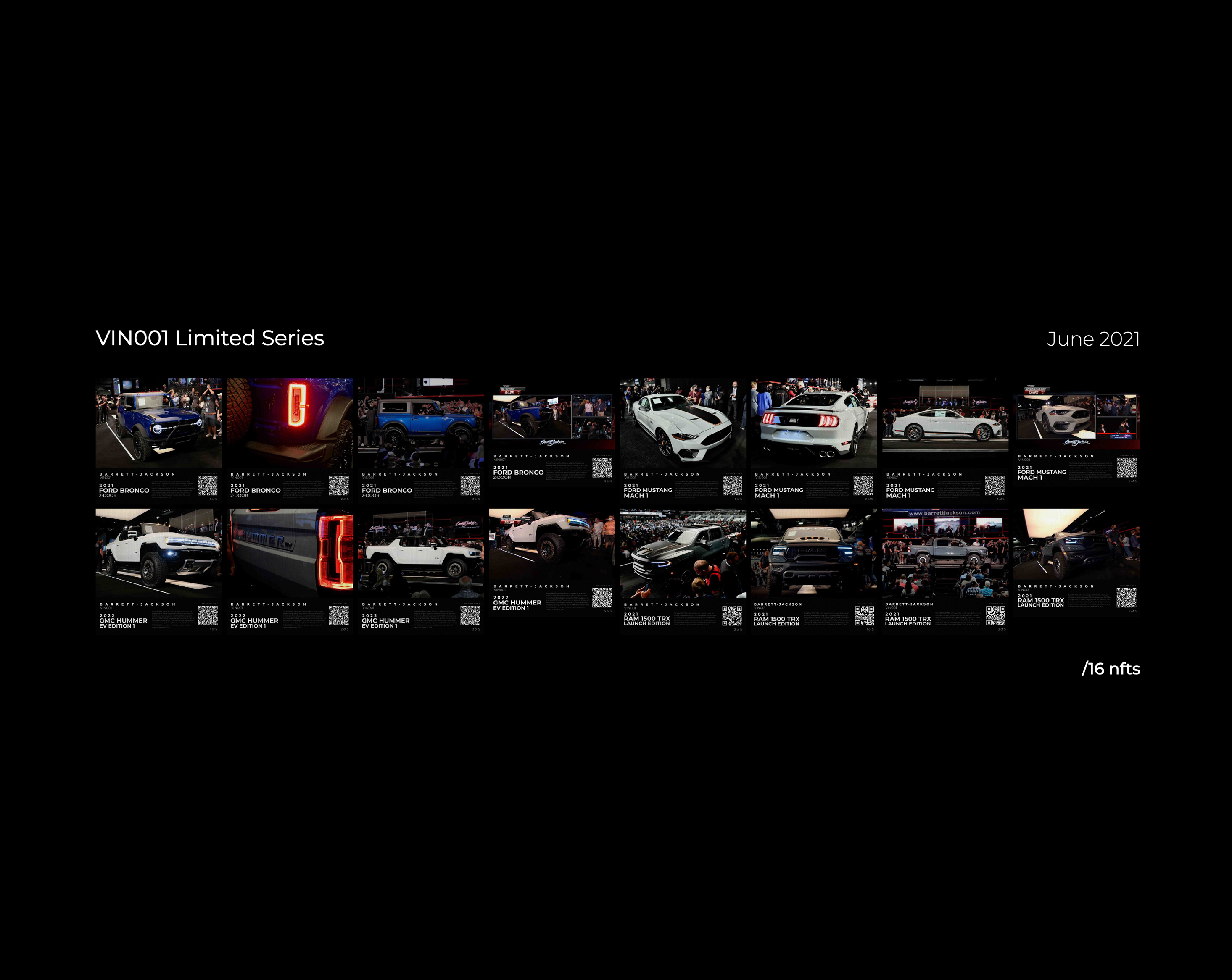
Upon joining Business Instincts Group in 2021, I was tasked with the design of Non-Fungible Tokens (NFTs) for the newly established MotoClub project. As a motion graphics designer, I was responsible for creating visually compelling NFTs that reflected the essence of the brand. Our team partnered with Barrett-Jackson to obtain the necessary materials, including photos and videos of the collectible vehicles auctioned off at their events. The project scope entailed the creation of three minted photo NFTs and one minted video NFT.
Over the past two years, while consistently releasing new content, I maintained a focus on enhancing the quality of our output. This involved continual improvement across several dimensions, including the overall style, typography, colour theory, application of textures, and symbolism. Through four major revisions and numerous smaller adjustments, I strived to deliver the highest possible value to our audience through the NFT production process.


DESIGN
EVOLUTION
May 2021
V1
Tasked to create a template for the production line of NFTs with only a week of devlopment the first Motoclub x Barrett-Jackson NFTs had dropped! Provided with vehicle photos I created a 3D parallax effect. Accompanied with each photo was the barcode providing information such as the car year/make/model, car description and a QR to link you too car’s listing. Each vehicle would get 5 NFTs minted.
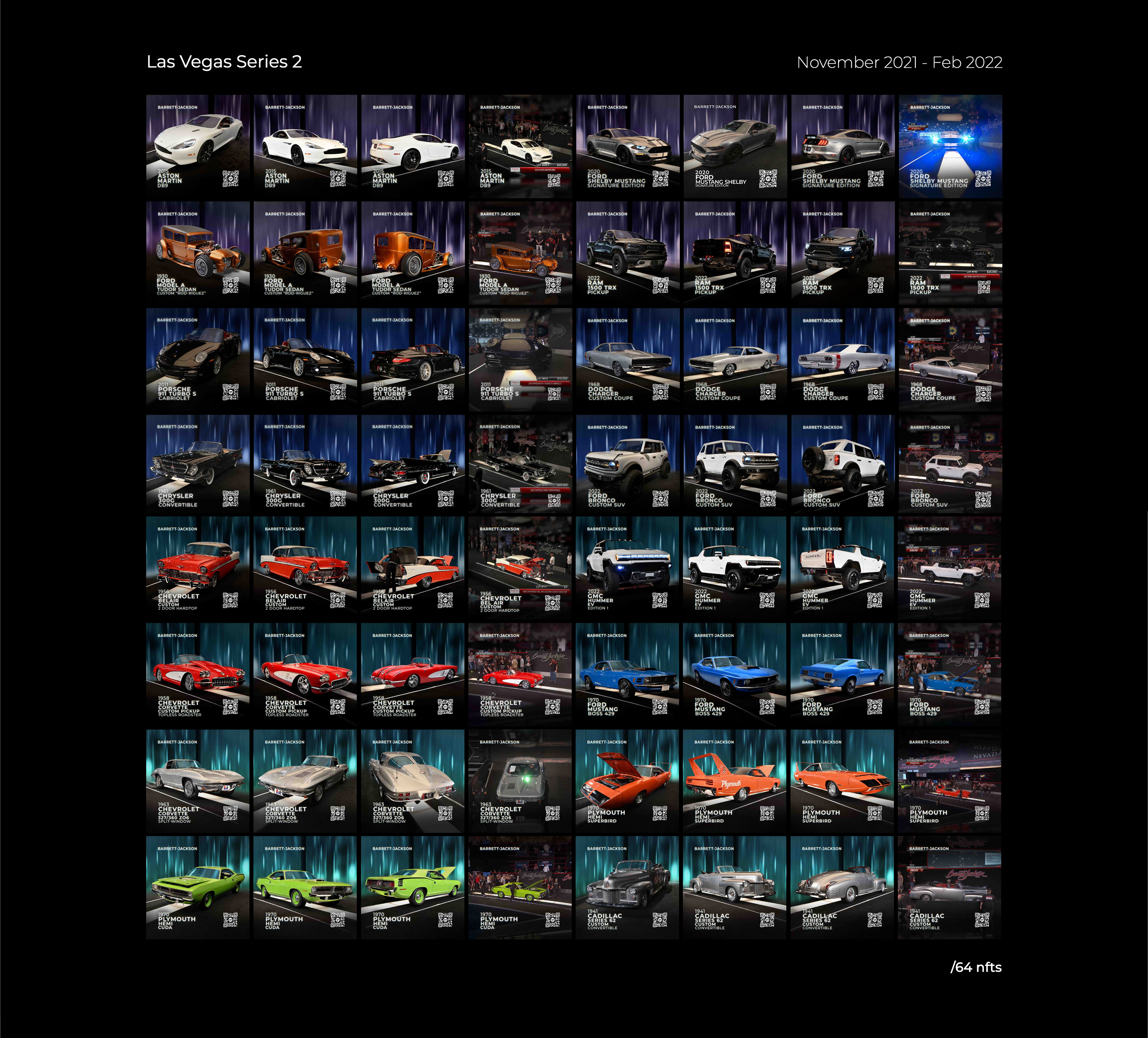
November 2021
V2
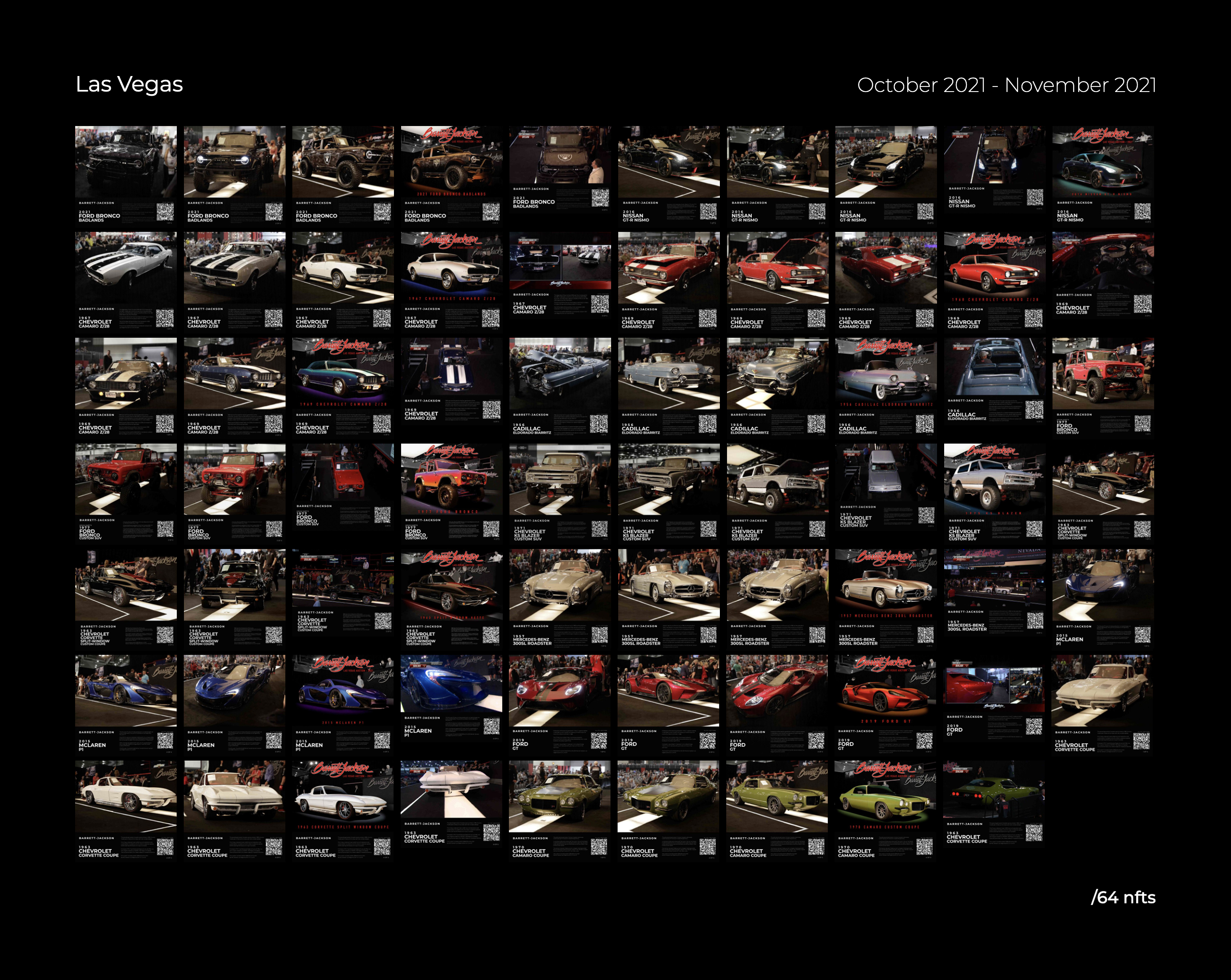
After 3 successful drops I had created 105 NFTs and it was back to the drawing board.Updates:-Pack intro animation added-new car intro animation-new backdrop-removed barcode-car title/QR animation
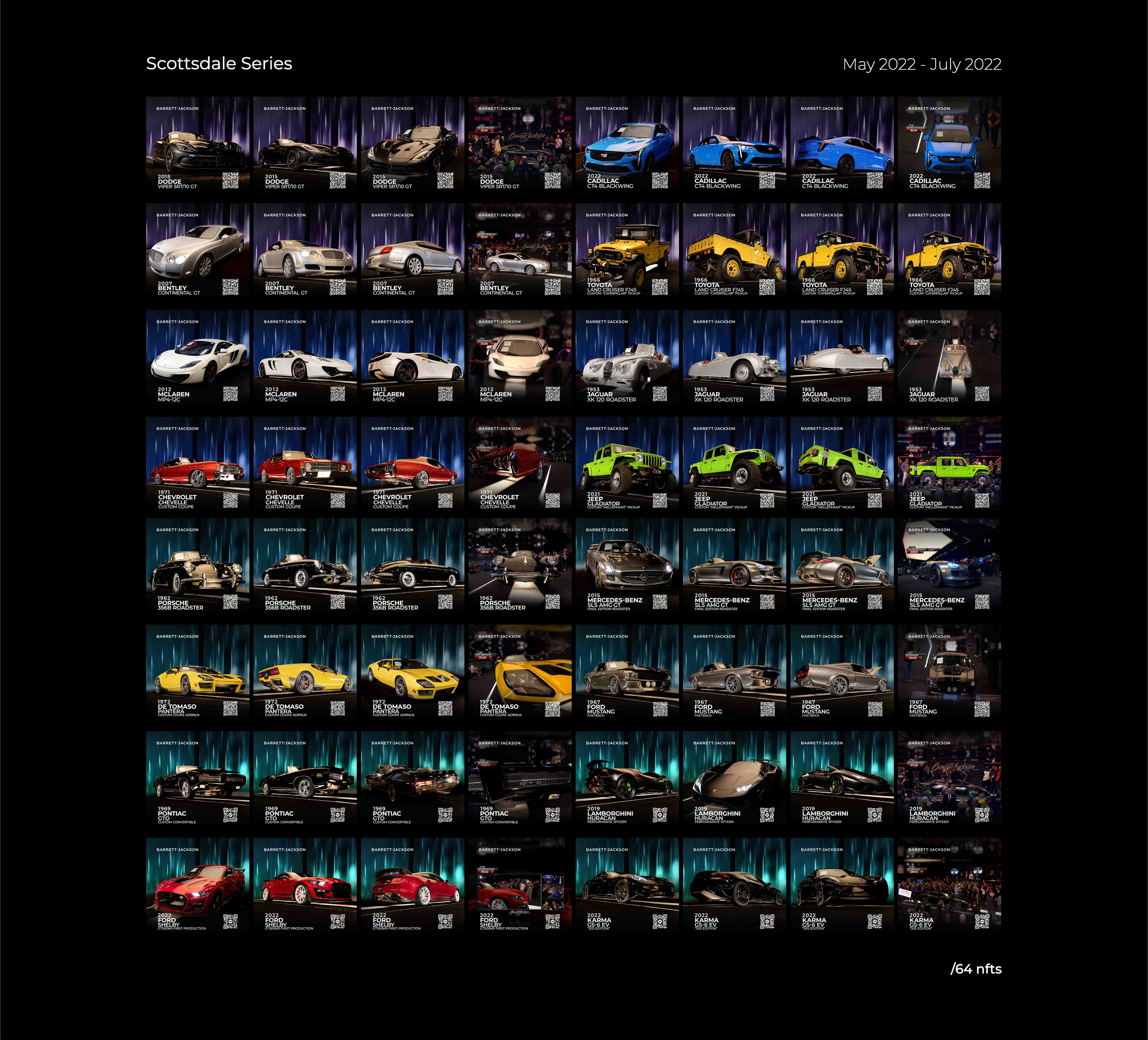
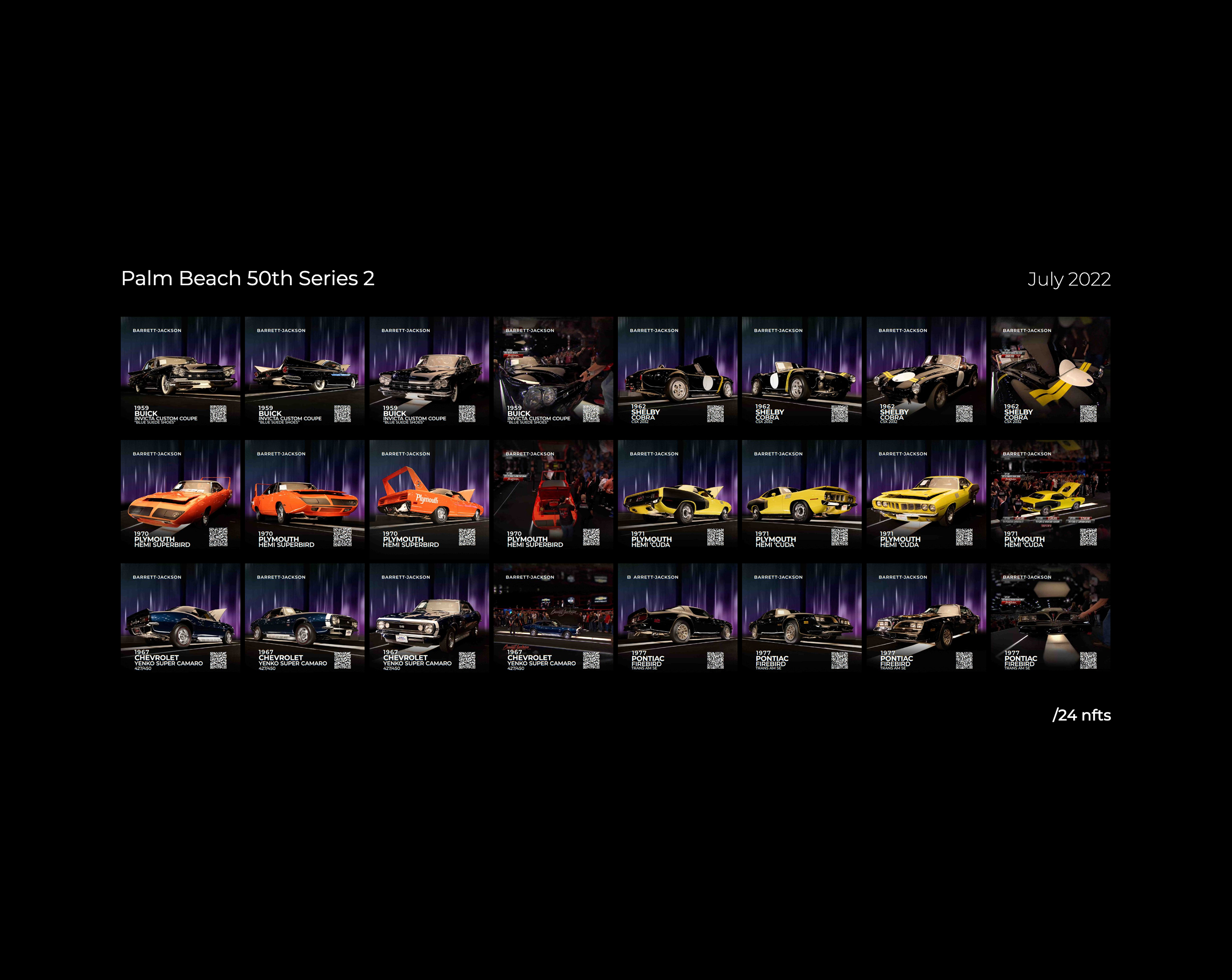
May 2022
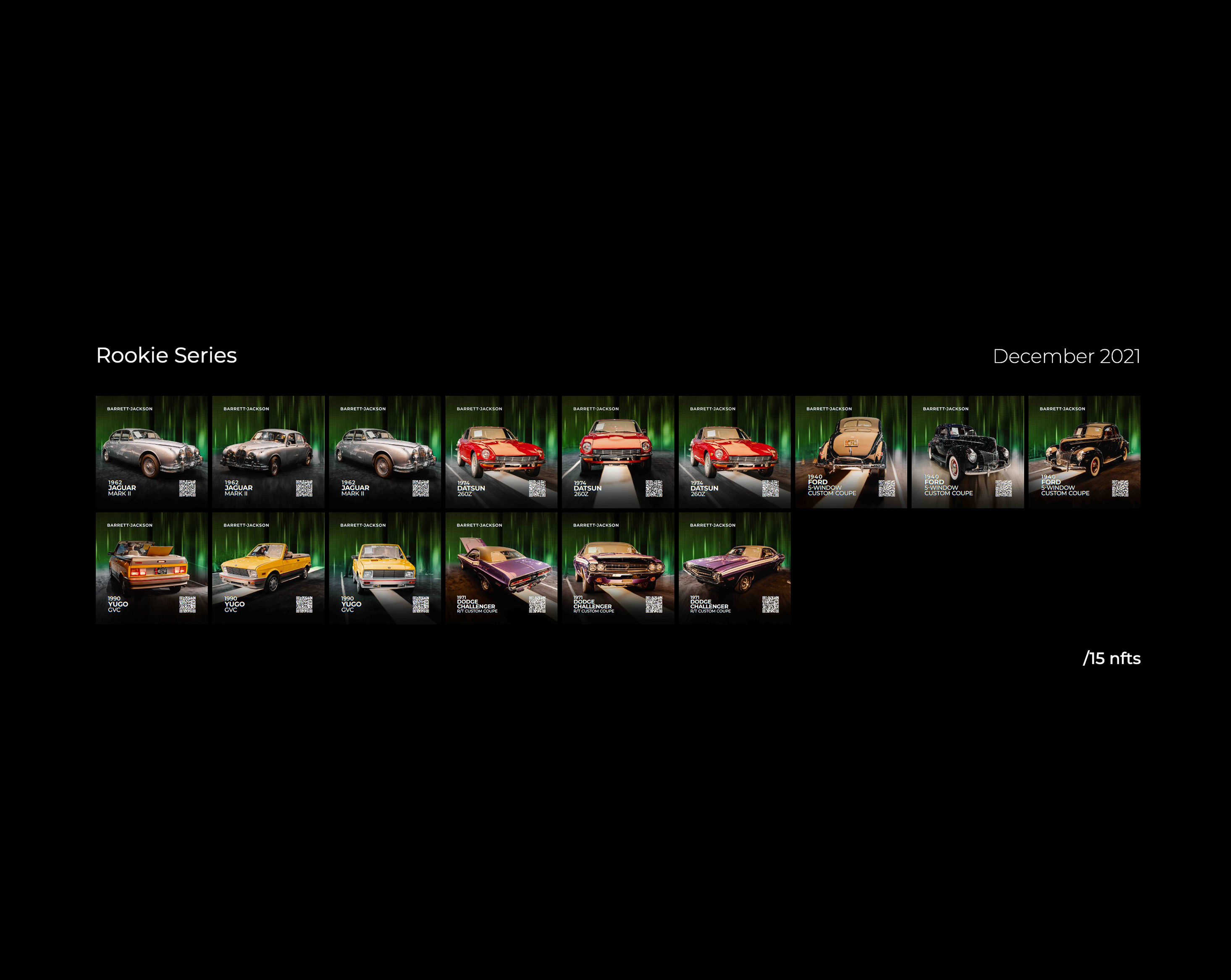
V3
After 3 successful drops I had created 105 NFTs and it was back to the drawing board.Updates:-Pack intro animation added-new car intro animation-new backdrop-removed barcode-car title/QR animation
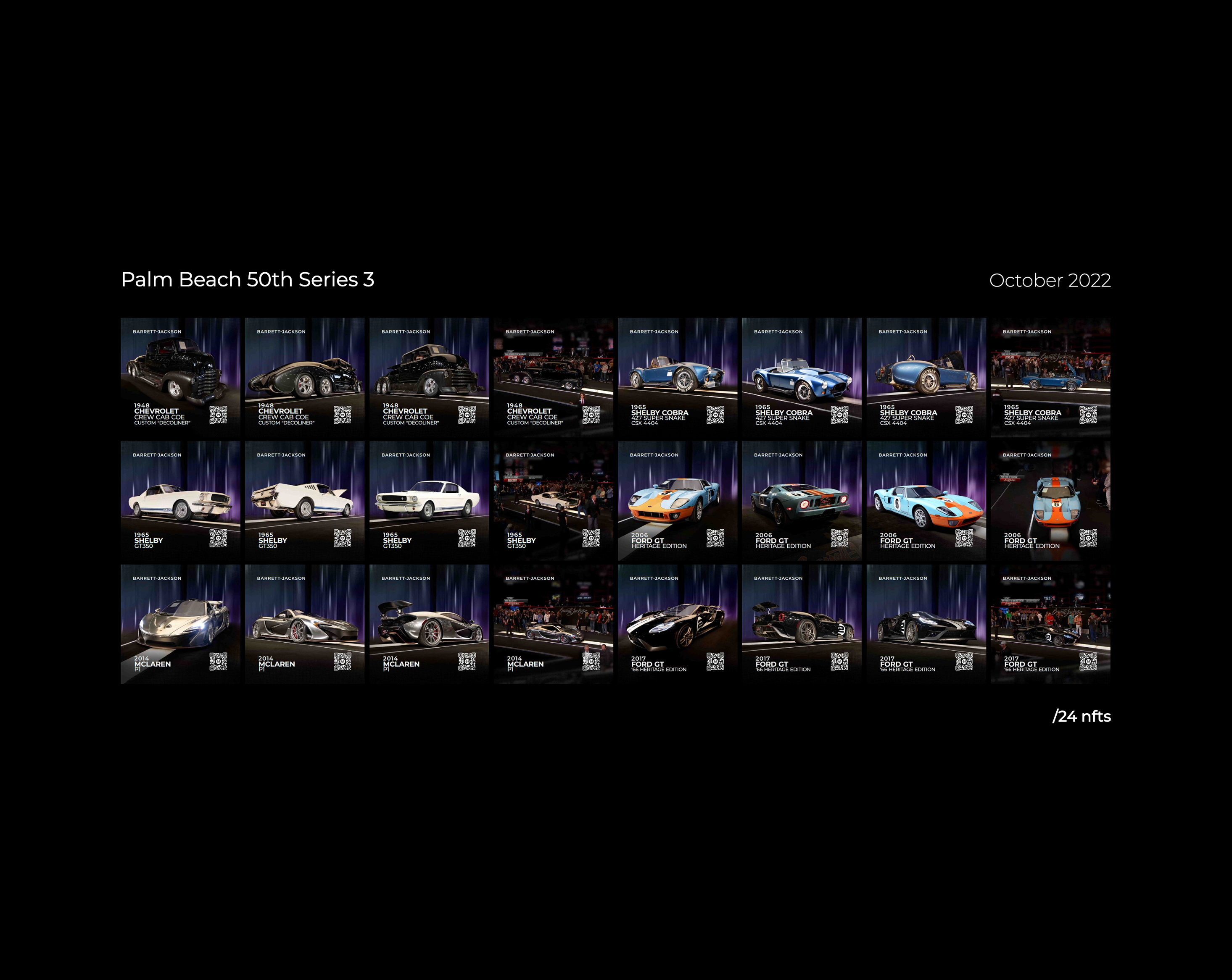
October 2022
V4
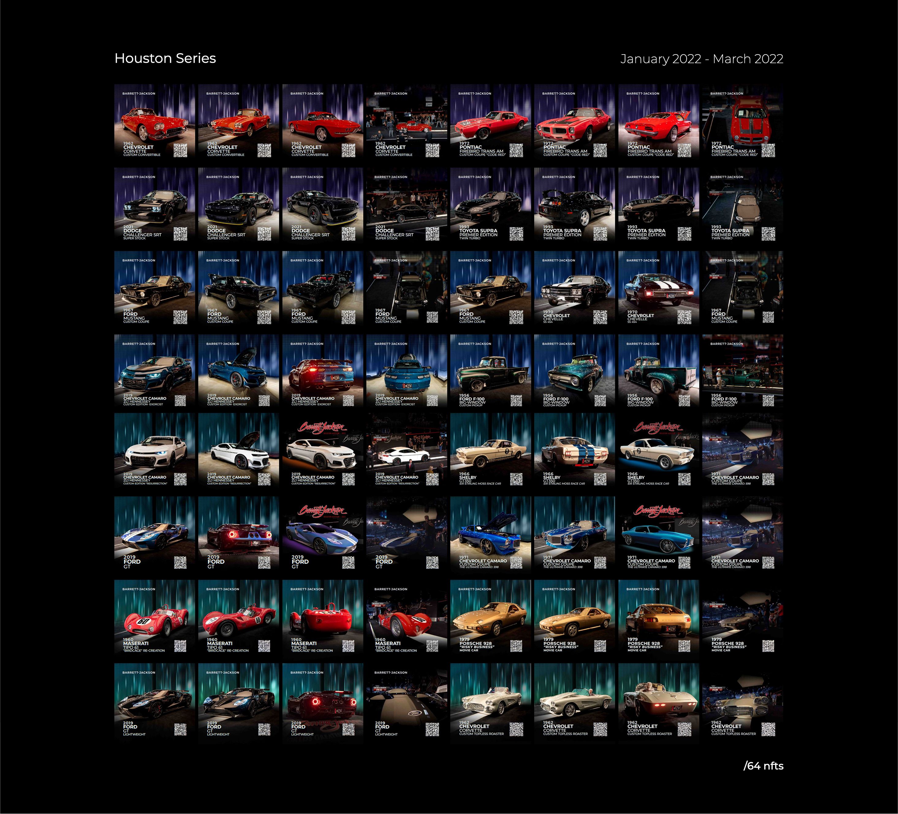
In this final update to my saga of NFTs I saw my time drawing to a close and I wanted to add those final touches to clean everything up and give it one last run.Updates:-Backdrop reflections added to car-New title animation-Pack Intro animation-Garage door animation updated-QR design update
DESIGN
ELEMENTS

TIERS
Each NFT was sub catagorized into tiers according to the vehicle, it’s history, and it’s sellling price in the order of; Premier, Prestige, Platinum, and Elite. Each tier was represented by a signified colour and a shape. Following the order of the tiers we have a cool gradient starting with purple and moving our way up to an indigo and for the Elite tier signifying the highest status, represented with a gradient encompassing every colour in the series. Each tier shape’s # of vertices represents the level of tier. Each Pack tier would be represented at the beginning of each NFT to allow users to signify its value. The tier’s colour is followed in the featured vehicle

FEATURED VEHICLE
This is the main effect, the center-piece if you will. I’m given the vehicle photo assets to prepare for VFX. It all starts with tearing down the scene in photoshop. First a selection of the car, then framing into a 1:1 ratio, and finally minor clean up and adjustments before it’s ready for Adobe After Effects. Once we load our photoshop files into After Effects we’re first going to use AI to create a depth-map. I can then later use that depth map to manipulate the perspective to give a parallax effect to the scene. From there we will add a couple layers of stylistic creativity. Although a virtual product, the aim was to the user the feeling of getting their first hot wheels car when they where kids.

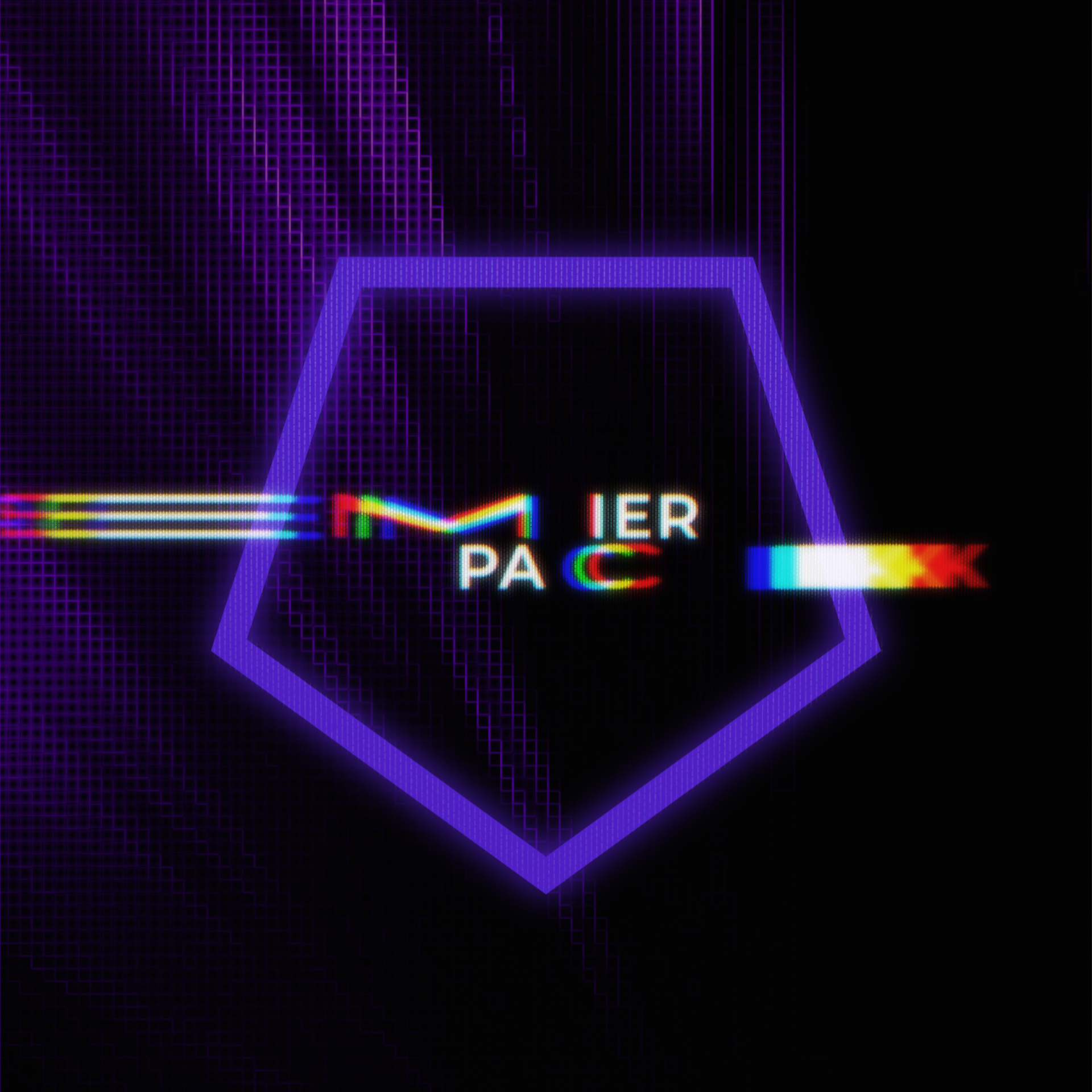
TYPOGRAPHY
When it came to creating the typography for our project, I was constantly focused on improving it. After all, typography is a crucial element in communicating with consumers. In the early stages of creating our first iteration, we intended to use the barcode as the direction for our typography. However, as we progressed, the team and I decided to blend the titles into the content of the NFT, rather than have them as a distinct separation. This allowed for more creativity in giving the typography a little motion intro.
During our second iteration of designs, we developed a new concept that included a garage opening animation and a pack intro animation, which involved more typography. It was then that I started honing in on the style guide for the NFT's typography, designing it from the ground up to resemble the look of LED lights. Over time, I experimented with different styles and processes to find what worked best. I needed to create type in shapes that would allow for animation to bring the type in and out, giving motion to these elements.
In its final iteration it's broken down starting with a stretch animation, followed with some custom and CRT/LED stylistic process, given a RGB split to resemble how light works and finally a stylized RGB time delay with a fast blur over top. A little masking for the transition and we're done!