Motion
Modelling
Texturing
Product
Environment
Typography
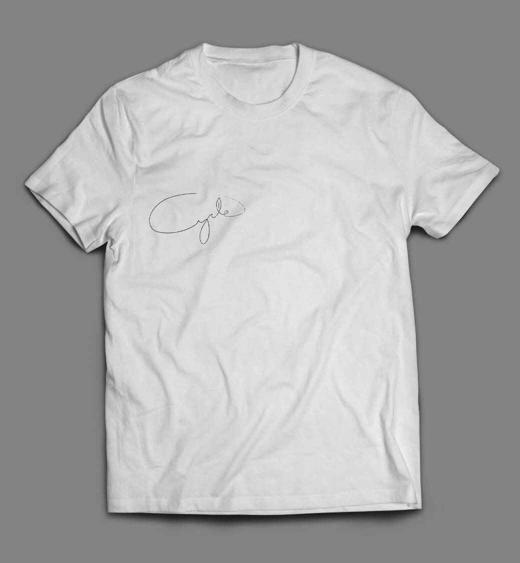
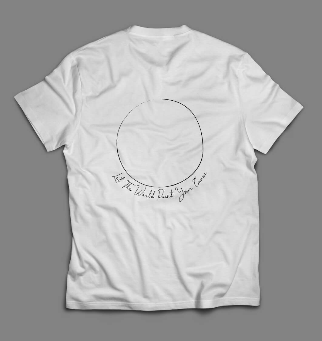
Cycle is a tree planting company located on the west side of Canada aimed to restore and bring awareness to the importance of our Forests. Their mission is to bring back life to the world and aid in global warming. The logo is simple and light to symbolize the importance of a smaller carbon footprint. The typography is script to resemble organic shapes and loops together to form the shape of a seed with a leaf in the middle resembling the "l". In-application media is kept in line with the brand's image. The graphics and logo are accompanied with white material to reflect the slogan, "let the world paint my canvas". Tree planting is a dirty business, the best way to add your colour is to give them white clothing and let earth do the painting.


Digital Design
Motion Graphics
3D Rendering
Conceptualization Production
4 Design Iterations/
9 drops/
367 digital assets/
Cycle is a tree planting company located on the west side of Canada aimed to restore and bring awareness to the importance of our Forests. Their mission is to bring back life to the world and aid in global warming. The logo is simple and light to symbolize the importance of a smaller carbon footprint. The typography is script to resemble organic shapes and loops together to form the shape of a seed with a leaf in the middle resembling the "l". In-application media is kept in line with the brand's image. The graphics and logo are accompanied with white material to reflect the slogan, "let the world paint my canvas". Tree planting is a dirty business, the best way to add your colour is to give them white clothing and let earth do the painting.
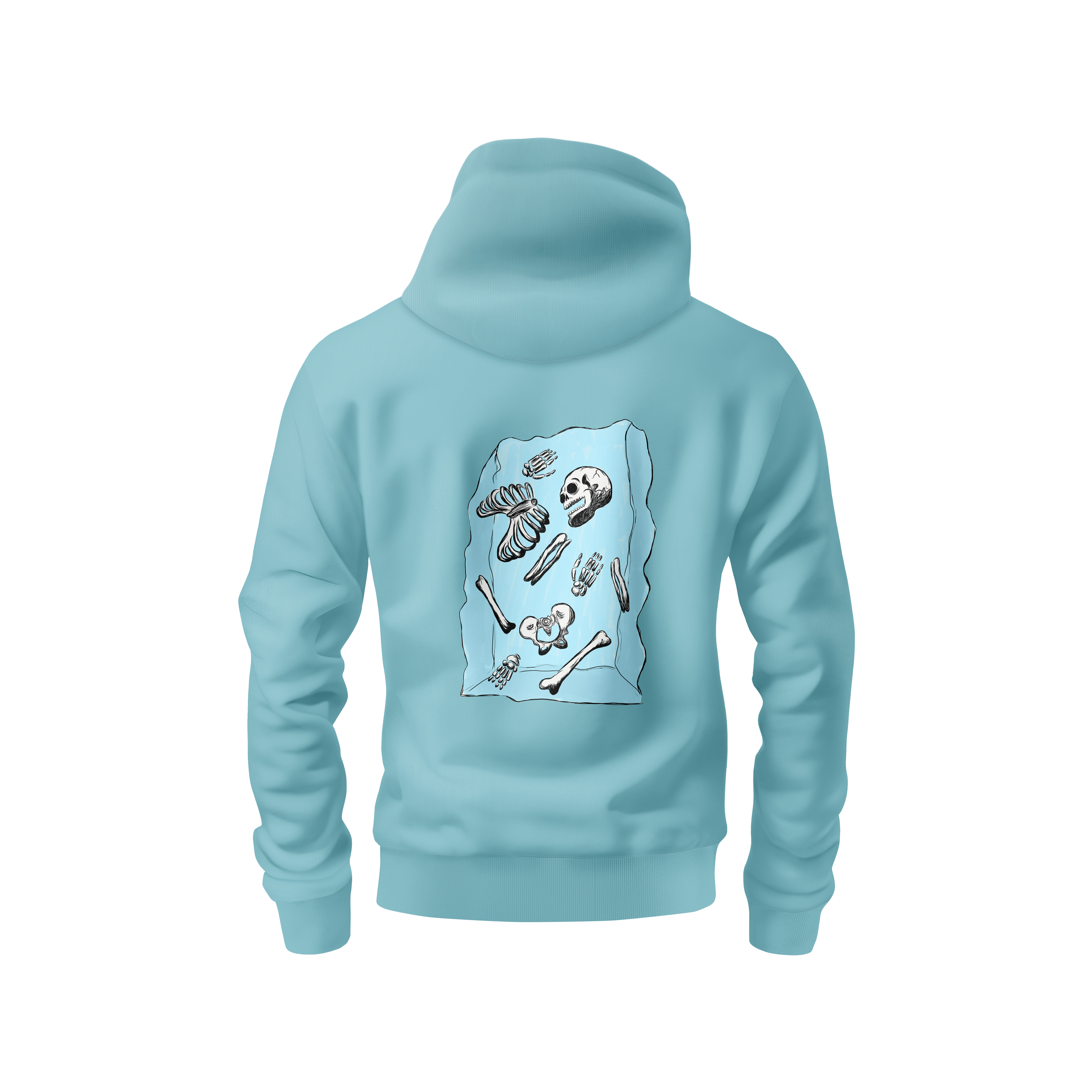
Four seasons is Cycle's apparel release of the depiction of a seed through every season symbolized by a skeleton, a representation of life and death. The illustration was given texture to resemble the look of wood carvings. Single use colours help aid the difference between each season. Each illustration is then transferred to a screen print on hoodies and sold through the tree planting company. For every hoodie purchase a tree is planted.

Graphic Design
Motion Graphics
Cycle is a tree planting company located on the west side of Canada aimed to restore and bring awareness to the importance of our Forests. Their mission is to bring back life to the world and aid in global warming. The logo is simple and light to symbolize the importance of a smaller carbon footprint. The typography is script to resemble organic shapes and loops together to form the shape of a seed with a leaf in the middle resembling the "l". In-application media is kept in line with the brand's image. The graphics and logo are accompanied with white material to reflect the slogan, "let the world paint my canvas". Tree planting is a dirty business, the best way to add your colour is to give them white clothing and let earth do the painting.
Navigating The Invisible is a revealing portrait of acclaimed visual artist Tim Whiten, an individual who survived war and overcame poverty and racism to become one of North America’s most prolific creators of cultural objects. This project is supported by the Canada Council for the Arts and the Ontario Arts Council.
Four seasons is Cycle's apparel release of the depiction of a seed through every season symbolized by a skeleton, a representation of life and death. The illustration was given texture to resemble the look of wood carvings. Single use colours help aid the difference between each season. Each illustration is then transferred to a screen print on hoodies and sold through the tree planting company. For every hoodie purchase a tree is planted.
Branding
UX/UI
motion graphics
logo design
Sprout is an app designed for the modern day gardener to utilize the use of hydroponic systems. Hydroponics have been shown to reduce water used by 80%, yield x2 the crops, and at a much faster rate. With50% of habitable land already being used for agriculture and in northern regions can only be used in warmer months.Through our app users can learn the inner workings of hydroponics and how they can set one up for themselves. Throughout the way they can learn about specific plants and their needs to determine the right crops for them to produce a maximum yield.
Four seasons is Cycle's apparel release of the depiction of a seed through every season symbolized by a skeleton, a representation of life and death. The illustration was given texture to resemble the look of wood carvings. Single use colours help aid the difference between each season. Each illustration is then transferred to a screen print on hoodies and sold through the tree planting company. For every hoodie purchase a tree is planted.
Branding
Design Principles
Vectors
Animation
Typography
Cycle is a tree planting company located on the west side of Canada aimed to restore and bring awareness to the importance of our Forests. Their mission is to bring back life to the world and aid in global warming. The logo is simple and light to symbolize the importance of a smaller carbon footprint. The typography is script to resemble organic shapes and loops together to form the shape of a seed with a leaf in the middle resembling the "l". In-application media is kept in line with the brand's image. The graphics and logo are accompanied with white material to reflect the slogan, "let the world paint my canvas". Tree planting is a dirty business, the best way to add your colour is to give them white clothing and let earth do the painting.
Four seasons is Cycle's apparel release of the depiction of a seed through every season symbolized by a skeleton, a representation of life and death. The illustration was given texture to resemble the look of wood carvings. Single use colours help aid the difference between each season. Each illustration is then transferred to a screen print on hoodies and sold through the tree planting company. For every hoodie purchase a tree is planted.
Branding
logo design
motion graphics
product design
Cycle is a tree planting company located on the west side of Canada aimed to restore and bring awareness to the importance of our Forests. Their mission is to bring back life to the world and aid in global warming. The logo is simple and light to symbolize the importance of a smaller carbon footprint. The typography is script to resemble organic shapes and loops together to form the shape of a seed with a leaf in the middle resembling the "l". In-application media is kept in line with the brand's image. The graphics and logo are accompanied with white material to reflect the slogan, "let the world paint my canvas". Tree planting is a dirty business, the best way to add your colour is to give them white clothing and let earth do the painting.
Four seasons is Cycle's apparel release of the depiction of a seed through every season symbolized by a skeleton, a representation of life and death. The illustration was given texture to resemble the look of wood carvings. Single use colours help aid the difference between each season. Each illustration is then transferred to a screen print on hoodies and sold through the tree planting company. For every hoodie purchase a tree is planted.


Lifestyle
Product
Portrait
Film
Landscape
Astro
Time
Wild


Cycle is a tree planting company located on the west side of Canada aimed to restore and bring awareness to the importance of our Forests. Their mission is to bring back life to the world and aid in global warming. The logo is simple and light to symbolize the importance of a smaller carbon footprint. The typography is script to resemble organic shapes and loops together to form the shape of a seed with a leaf in the middle resembling the "l". In-application media is kept in line with the brand's image. The graphics and logo are accompanied with white material to reflect the slogan, "let the world paint my canvas". Tree planting is a dirty business, the best way to add your colour is to give them white clothing and let earth do the painting.
Four seasons is Cycle's apparel release of the depiction of a seed through every season symbolized by a skeleton, a representation of life and death. The illustration was given texture to resemble the look of wood carvings. Single use colours help aid the difference between each season. Each illustration is then transferred to a screen print on hoodies and sold through the tree planting company. For every hoodie purchase a tree is planted.
Film
Commercial
Lifestyle
Instructional
Visual
VFX
/Video Editing/Motion Graphics/Colour Grading/Titling/
/Video Editing/Colour Grading/Titling/
Video Editing/Motion Graphics/Colour Grading/Titling/
/Videography/Video Editing/Motion Graphics/
/Colour Grading/Titling/
/Videography/Video Editing/Colour Grading/Titling/
/Videography/Video Editing/Colour Grading/Titling/
Cycle is a tree planting company located on the west side of Canada aimed to restore and bring awareness to the importance of our Forests. Their mission is to bring back life to the world and aid in global warming. The logo is simple and light to symbolize the importance of a smaller carbon footprint. The typography is script to resemble organic shapes and loops together to form the shape of a seed with a leaf in the middle resembling the "l". In-application media is kept in line with the brand's image. The graphics and logo are accompanied with white material to reflect the slogan, "let the world paint my canvas". Tree planting is a dirty business, the best way to add your colour is to give them white clothing and let earth do the painting.
Four seasons is Cycle's apparel release of the depiction of a seed through every season symbolized by a skeleton, a representation of life and death. The illustration was given texture to resemble the look of wood carvings. Single use colours help aid the difference between each season. Each illustration is then transferred to a screen print on hoodies and sold through the tree planting company. For every hoodie purchase a tree is planted.


